Expect More From
Your Transit Asset
Management Software
ETA provides your agency with comprehensive CAD/AVL transit asset management software solutions that optimize operations, enhance passenger experience, and improve overall efficiency.

The future of ITS software for transit has arrived
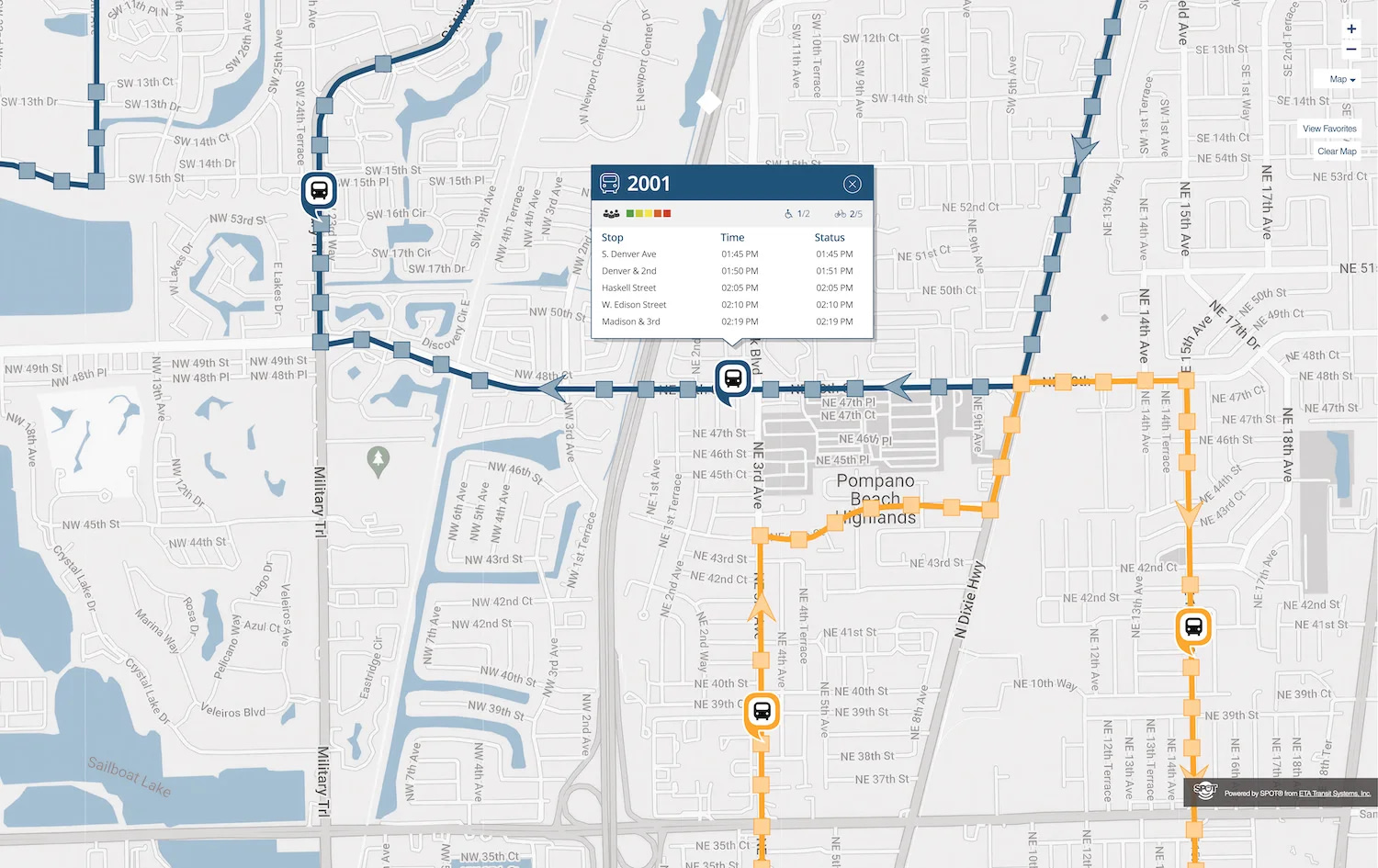
At its simplest, you want your transit asset management software to deliver real-time tracking of your bus, shuttle, or train. Our exclusive SPOT system is ITS software for transit that is a powerhouse in data collection, gathering and pulling together information about all your operations. As next-generation transit CAD/AVL software company, we harness the power of the cloud to deliver 99.9 percent uptime, anywhere access and control, and delivers the necessary tools and resources for you to analyze and interpret this data to make meaningful decisions about your operations. But don’t trust us, hear why our loyal clients have stayed with us at an alarming retention rate of 96%!


Trusted by municipalities across the nation.

Space Coast Area Transit, Florida

City of Coral Gables, Florida

Auburn University, Alabama

City of Yorktown, Virginia

Suffolk Transit, Virginia

TARTA
Evolved transit asset management software
ETA Transit takes operations to a new level with its sophisticated software solutions. Our transit asset management software is designed to streamline and optimize the handling of your business’ assets – whatever they may be. From buses to shuttles, our software provides a centralized platform for monitoring, control, maintenance, and strategic planning. This ensures that transit agencies like yours can efficiently track and manage all of their assets, leading to improved operational efficiency and cost-effectiveness.


A pioneering transit CAD/AVL company
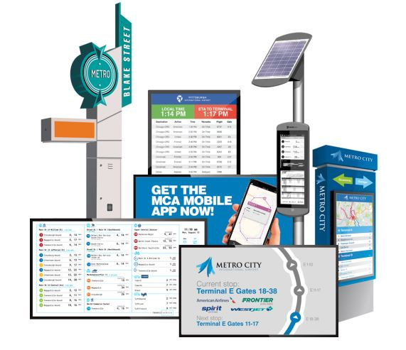
Our SPOT transit management software is a powerful integration platform for connecting onboard hardware systems like passenger counters, fare collection, and infotainment. It frees you from the shackles of legacy ITS hardware, eliminating the need for new equipment, servers, or IT staff. With ETA Transit’s expertise, SPOT ensures seamless integration with your existing equipment, rapid deployment, simplified software setup, and robust training with ongoing support for transitioning from your current ITS vendor. Leave legacy, on-premise servers and outdated hardware interfaces in the past and bring your agency into the future with our reliable cloud-based servers.
For transit agencies seeking reliable Computer-Aided Dispatch (CAD) and Automatic Vehicle Location (AVL) solutions, ETA stands as one of the foremost transit CAD/AVL companies. Our CAD/AVL system empowers agencies with precise vehicle tracking, efficient dispatching, and accurate real-time information. This results in optimized routes, improved communication, and an overall enhancement of your transit services.
A forward-thinking setup for your transit operation
With the effectiveness and efficiency of your transit operations at stake, why rely on outdated software and unreliable hardware? ETA Transit has emerged as a key player in the industry, offering not only transit asset management software and ITS solutions but also establishing itself as one of the leading CAD/AVL companies. We are ready to put our vast expertise in the industry to work for you, applying a holistic approach to transit management that sets ETA apart. Simply put, we provide agencies with the tools they need to navigate the challenges of modern urban mobility. Whether running 5 vehicles or a large fleet, ETA Transit will bring our deep industry experience to bear to improve your operation’s efficiency and effectiveness with deployment in weeks, not months.


Unparalelled engineering
Our transit asset management software is user-friendly, with an intuitive interface and a variety of pre-built software modules that offer increased ROI and functionality. Regular system updates are included, guaranteeing access to the latest version of SPOT CAD/AVL software, while still operating seamlessly with your existing hardware. Your software will continually improve, becoming more powerful, intuitive, and adaptable to the evolving challenges presented by the mass transit market.
In the realm of Intelligent Transit Systems (ITS), ETA stands out as a provider of cutting-edge software tailored for transit operations. The ITS software offered by us integrates advanced technologies to enhance real-time monitoring, data analysis, and decision-making. This creates better control over transit systems, leading to improved responsiveness, reduced delays, and enhanced overall performance. Your agency can rely on ETA Transit’s ITS software to navigate the complexities of modern operations seamlessly.
Expect more
Reach out today to start the conversation that will revolutionize your transit operation!
"*" indicates required fields